Hi, everyone! It’s Jenn from Endlessly Inspired again with my last guest post of the year! {Julie’s got all sorts of special fun for you next month!}
I got a Land of Nod catalog the other day and as I was looking through it, I saw this wall art and fell in love.

{Ok, who am I kidding. I fell in love with pretty much everything in their catalog. I can’t take it, their stuff is just entirely too cute for words. I mean, seriously? And this? Or this? I can’t handle it.}
Anyway. This wall art. Loved it. Then I looked at the price. Holy moly, it’s $179. I decided then and there that I was going to make something similar myself.
So I did. And it was super easy. {Note: This is a pretty long tutorial, but don’t be intimidated: that’s only because I am approaching this as though you’ve never used PicMonkey before. If you’re familiar with the site, you can easily just skim through and see basically how I did everything.}
If you’ve never heard of PicMonkey, you need to check it out, stat. It’s an amazing, free photo editing website. I use it almost every single day, and it’s what I use to edit all the photos for my own blog. While there is a very good free option, PicMonkey does have an upgraded membership available for anywhere from $2.75 – $5/month {depending on whether you do monthly or yearly payments} that includes additional fonts, overlays, features, effects, etc. I paid for the upgraded membership and find it to be very useful, but if you’re just using it for personal things, you may not need it.
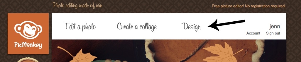
To start, go to PicMonkey, hover over “Design” and click “Custom”.

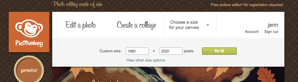
This will bring up a menu that allows you to choose your canvas size, so the first thing you’ll need to do is figure out what size you want your final print to be. If you want yours to be one of the sizes listed, just click on one of those. I decided to make mine 11″ x 14″, so I clicked “Custom”, which brought up some boxes where you can create your own canvas. Unfortunately, it uses pixels instead of inches, so unless you can figure out proper pixel sizes in your head {which, considering that you’re reading this tutorial, I’m guessing you can’t}, you can check out this site to see what you need those numbers to be.
I always double those numbers to be safe {I’d rather a print be too-high quality than all pixelated and wonky looking}, so I put in 1980 x 2520 and clicked Do It!
Now comes the fun part. Click on the “Tt” icon on the left side of the screen to bring up the font options. Scroll through and pick whichever font you’d like. {The ones with a crown icon next to them are premium fonts and can only be used if you upgrade to the paid membership.}
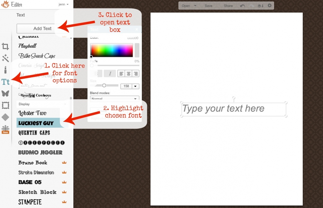
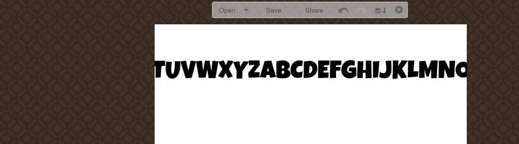
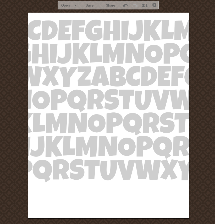
Once you’ve chosen your font {I’m using Luckiest Guy}, click the name to highlight it and then click “Add Text.” That will bring up a text box and a text control panel. Starting in the middle of the alphabet, just start typing letters in. We’re only going to do this once, so you want to do about two whole alphabets in there, so you’ll have wiggle room when you’re lining them up later. {If you have no idea what I’m talking about, just trust me and hang in there; this will all make sense in a few minutes.}
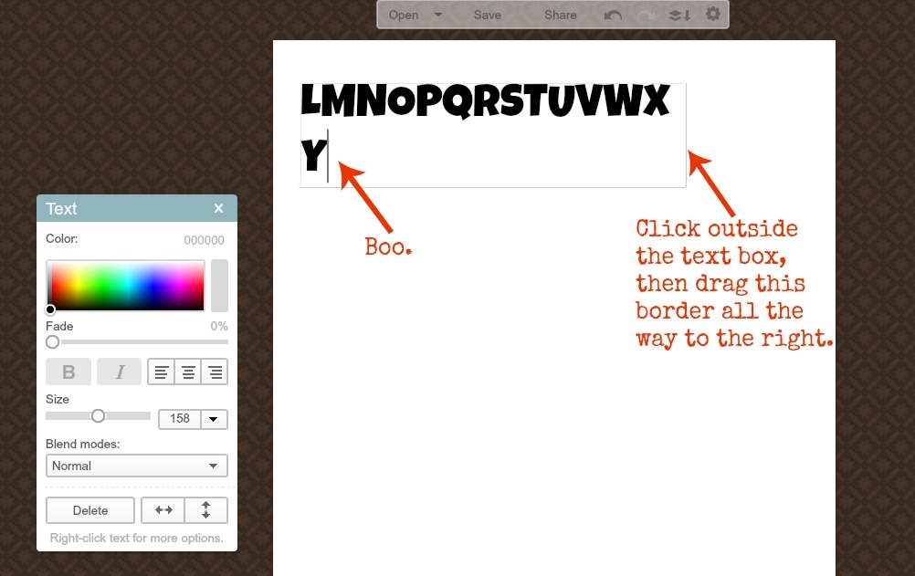
When you get to the end of the text box, it’s going to automatically wrap the text down to the next line. We don’t want this; we want one long line of letters. To make room for the rest of the letters, click and drag the border on the right side of the text box as far to the left as it will go. {You will need to click somewhere outside of the box so that you see little circles on each of the corners.}
When you get to a place where you can’t go any farther, just click outside the text box again to bring up the little circles on the corners and click and drag the box as far to the left as you can. Then stretch out the text box again and keep typing.
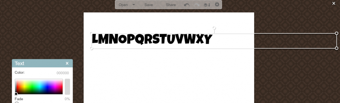
Don’t panic if you click outside the box and the letters that are to either side of your canvas disappear; this is exactly what you want to happen.
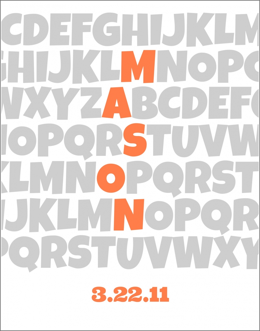
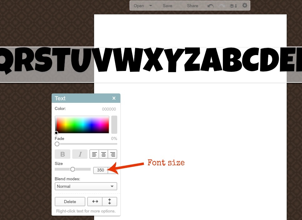
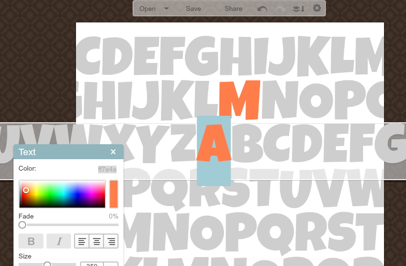
What size you make your font is going to depend on how many letters are in the name you’re using, because you’ll need to have as many rows as letters in the name, plus one or two extras on the top and bottom. I’m using “Mason” so I am going to use 7 rows: one blank one on top, five for his name, and one blank one on the bottom. You’ll just need to play around with the text box to find the proper size. For 7 rows on an 11″ x 14″ canvas, I set my font size to 350.
To change your font color, select all of your letters in the text box. You can then click on the color map until you find a color you like. For this tutorial, I’m using a light gray for the background letters.
Now you’re going to start creating your rows. Place the text box towards the top of the canvas, and position it so whichever letters you’d like are visible.
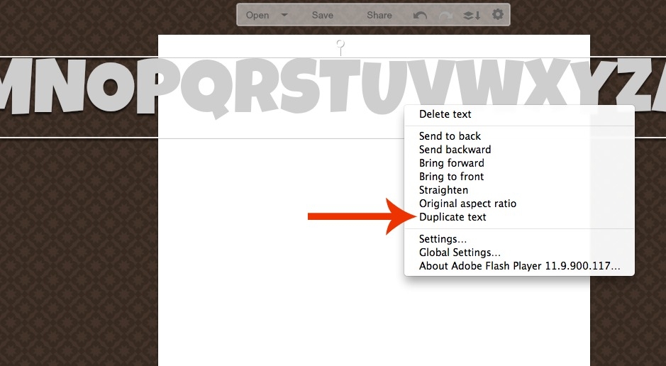
To create the next row, Control-Click the text box {or right click if you’re on a PC} and select Duplicate text. Then just drag the new row down so it’s right below the first one, and then slide it left to right so that a different portion of the alphabet is visible.
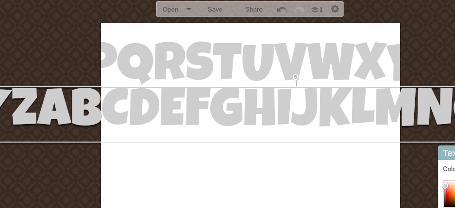
Continue to do this to create the number of rows that you decided on earlier. For the extra rows, it doesn’t matter what part of the alphabet is showing, but for the name rows, you want to arrange them so the name is spelled out down the rows. You’ll also want to leave a bit of space at the bottom for the birthdate.
Now you’ll go back and highlight the name by changing the font color of just those letters. I am going to use a bright orange. Click on the row with the first letter of the name, and then highlight just that letter. Then click around on the color map until you find a color you like. Note the combination of letters and numbers at the top right of the map, because you’ll need these in a minute.
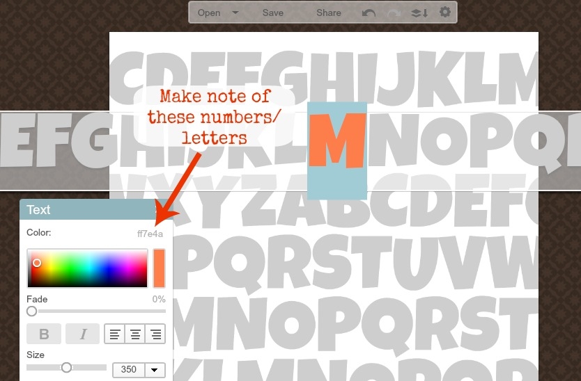 Click on the next row and highlight the second letter of the name. Click on the letters/numbers, type in the combination you chose in the last step, and hit enter. This will make the second letter of the name exactly the same color as the first.
Repeat these steps for the rest of the letters in the name.
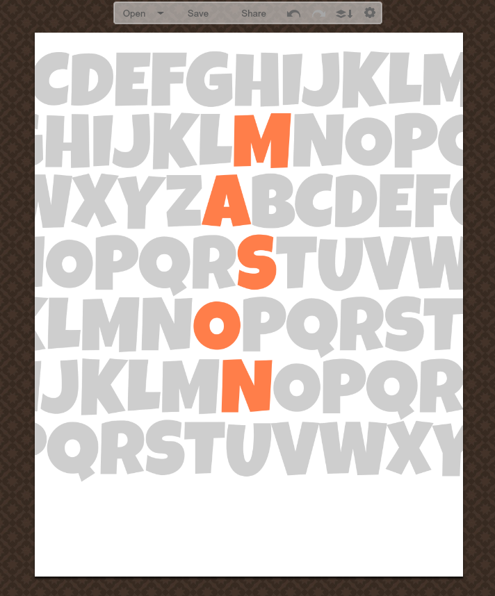
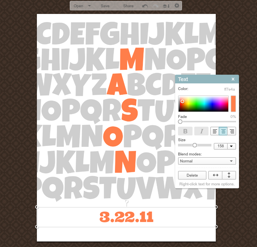
For the birthdate, just make another text box, make the font the same color as the letters in the name, and type it in. The font I used for mine is Ultra.
The easiest way to make sure your birthdate is centered is to stretch the text box out so that the little circles in the corners are even with the edges of the canvas, and then center your font within the text box.
You’re done! Click “Save” at the top, and select the highest quality file, which is Sean. {Don’t ask me why, I don’t know.} You can now print out your art wherever you want! I usually use Walmart’s one-hour service, just because it’s closest to me and pretty cheap, but if you have a good printer, you could even print it out yourself.
I messed around a bit and made a couple of other ones too, just to show you how different you can make them look. The possibilities are endless!